A hotel logo is the smallest, most compressed expression of a much larger design system that eventually has to extend into furniture, signage, uniforms, and the layout of the lobby itself. The hotels that feel genuinely designed, rather than merely decorated, are the ones where that extension from mark to physical space follows a clear, traceable logic rather than stopping at the sign out front.
The Logo Should Set Rules, Not Just Provide a Symbol
A strong hotel brand identity isn't just a mark, it's a small set of design rules (a color palette, a typographic system, a few recurring shapes or motifs) that the rest of the property's design can reference and extend. When a brand system is built this way, the interior designer, the signage fabricator, and the uniform supplier are all working from the same underlying logic, even though none of them are copying the logo directly.
Without that shared rule set, each vendor tends to default to their own professional instincts, which often produces individually reasonable but collectively inconsistent results: lobby furniture that doesn't share a color language with the signage, uniforms that feel like they belong to a different property entirely — the same rule-setting role a logo plays is covered in 20 boutique hotel logos that get branding right.
Writing these rules down early, even in a short, informal document before the full brand guidelines are finalized, gives every vendor working on the project a shared reference point from day one. Waiting until the logo and primary materials are finished before documenting the underlying rules often means some vendors have already made decisions based on their own assumptions, decisions that then have to be revisited once the actual system is written down.
Materials Carry the Brand as Much as Color Does
A color palette is only part of how a brand identity extends into physical space. The actual materials chosen, brushed brass versus polished chrome, raw wood versus lacquered, matte versus glossy finishes, communicate personality just as strongly as color does, and often more durably, since materials don't fade or get repainted on the same schedule as walls.
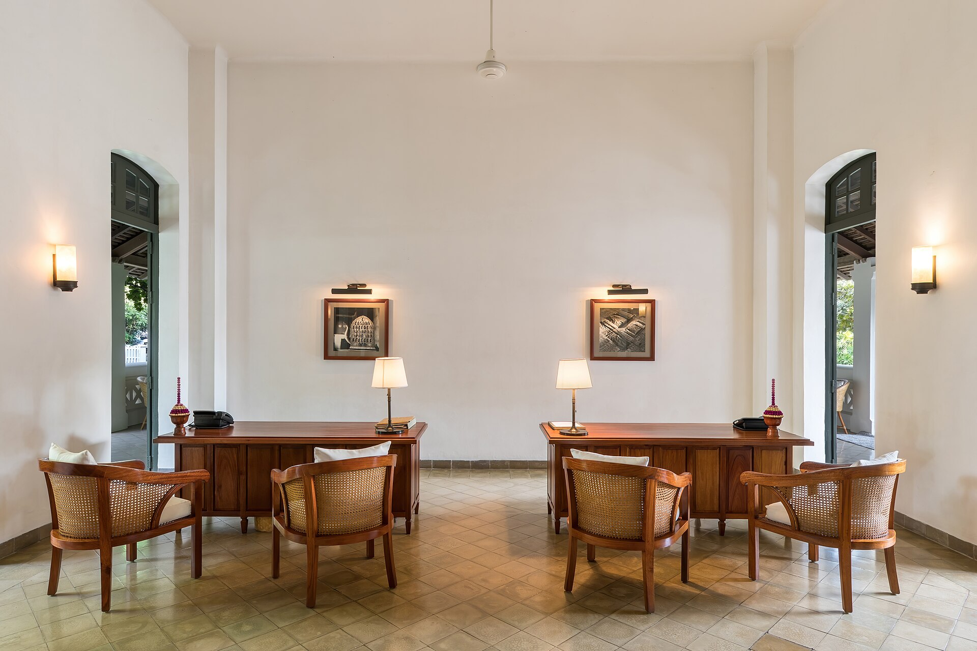
The hotels that carry their identity most convincingly into the lobby tend to have made an explicit decision about material language early, alongside the color and typography decisions, rather than leaving material choices entirely to the interior designer's independent judgment partway through the project.
A short material palette, two or three finishes used consistently rather than a different material for every surface, tends to read as more intentional for exactly the same reason a narrow color palette does. An interior designer given a clear material language to work within, rather than an open brief, usually produces a more cohesive result than one asked to independently choose finishes that happen to feel appropriate without any shared reference point.
Signage Is Where Brand Systems Most Often Break Down
Wayfinding and directional signage inside a hotel is usually produced by a different vendor, on a different timeline, than the original brand identity work, and it shows: mismatched typefaces, slightly-off colors, a completely different visual language for "Elevator" and "Restrooms" signs than for the lobby's main brand presence. This gap is one of the most common and most noticeable breaks in an otherwise consistent hotel brand.
Closing this gap requires treating signage as part of the original brand deliverable, with the same typeface and color specifications handed directly to the signage fabricator, rather than as a separate, later project briefed only with "match our branding" and left to that vendor's own interpretation — the full case for this is in signage and wayfinding design: the overlooked part of hotel branding.
In practice this often just means scheduling the signage vendor into the same early kickoff meeting as the core brand designer, rather than bringing them in weeks or months later once everything else is already finished. A signage fabricator who hears the reasoning behind a color or typeface choice directly from the people who made it tends to apply it more faithfully than one working only from a swatch and a logo file handed over secondhand.
Staff Uniforms Are a Visible, Moving Extension of the Brand
Uniforms are one of the most visible touchpoints a guest actually interacts with throughout a stay, and they're also one of the touchpoints most often treated as a separate, lower-priority decision from the rest of the brand system. A uniform color or style that doesn't connect to the hotel's established palette creates a small but persistent disconnect every time a guest interacts with staff.
The properties that get this right tend to involve the same brand or design team that worked on the core identity in selecting uniform colors and styles, rather than leaving that decision entirely to an HR or operations department working from a generic uniform supplier catalog.
This doesn't need to mean a custom uniform design from scratch, which can be far more expensive than most properties can justify. Often it's as simple as the brand team reviewing a standard supplier's catalog and specifying the exact color codes and fabric options that match the established palette, rather than letting operations pick whatever looks reasonably close from the available stock options.
Consistency Is Easier to Plan Than to Maintain
A hotel brand system can launch perfectly consistent across logo, signage, interiors, and uniforms, and then slowly drift as individual elements get replaced over the following years: a worn sign repainted slightly differently, a uniform reordered from a new supplier with a close-but-not-exact color match, new furniture purchased without reference to the original material specification. This slow drift is often more damaging to brand consistency than any single bad decision made at launch.
The hotels that maintain their design language well over time tend to keep accessible records, actual paint codes, fabric specifications, typeface license files, so that replacements and repairs years later can match the original intent rather than approximating it from memory or old photographs — the same kind of organized documentation is covered in how to stay organized as a freelance designer with clients in different time zones.
A simple, low-cost way to build this habit from the start: keep one shared, clearly organized folder (digital or physical) with the actual paint cans' codes, fabric swatch cards, and signed-off specification sheets, updated every time something is reordered or replaced. Properties that skip this step usually end up reconstructing the original specification from memory or guesswork the first time something needs replacing years after the original launch team has moved on.