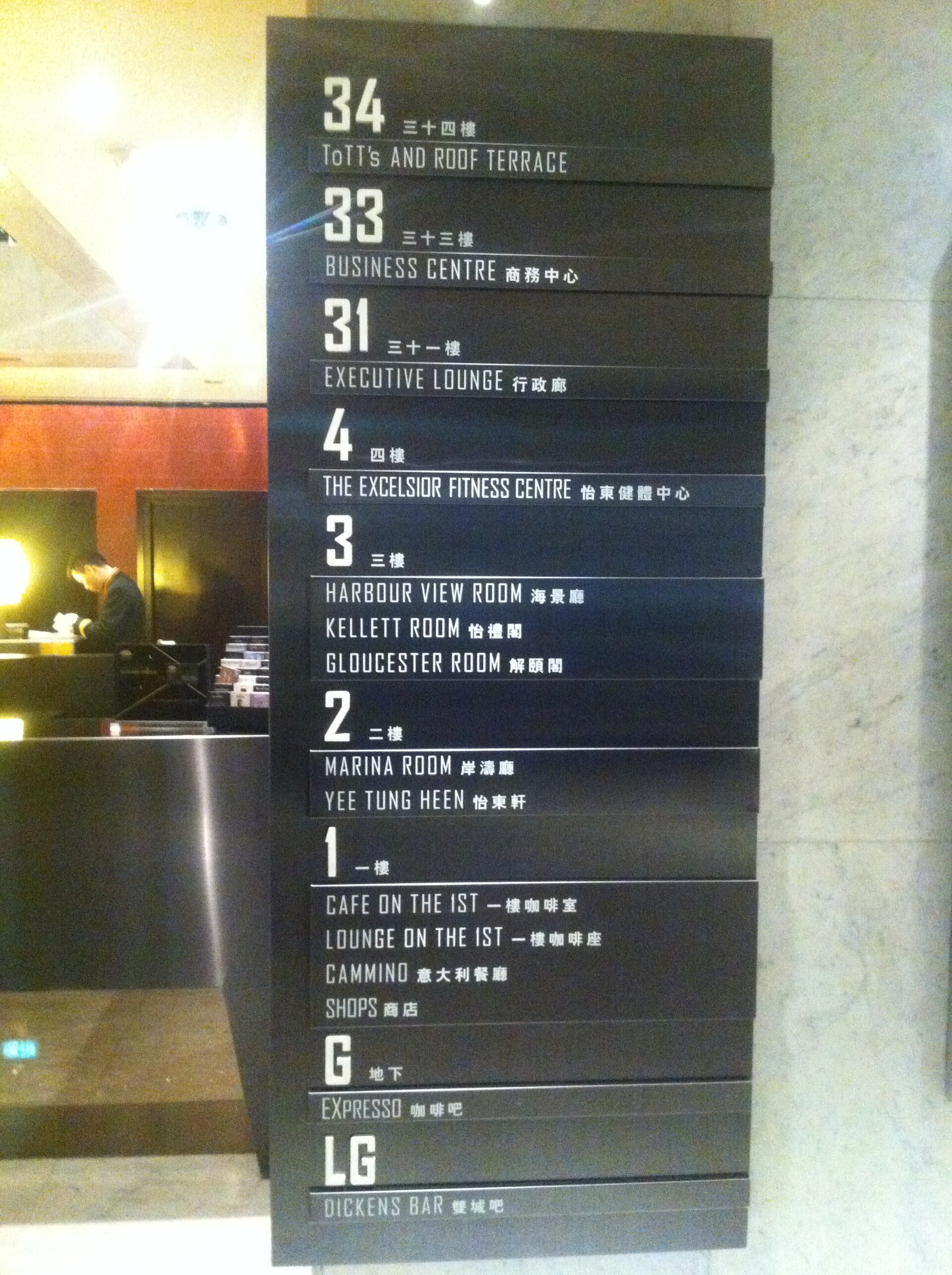
Hotel branding projects routinely pour attention into the logo, the color story, and the lobby's first impression, while treating wayfinding signage, the directional signs to elevators, restrooms, the pool, meeting rooms, as a purely functional afterthought handled late in the project. That imbalance shows up constantly in otherwise well-branded properties, where a beautiful lobby mark gives way to generic, mismatched directional signage just a few steps further into the building.
Function and Brand Aren't Actually in Tension
The usual excuse for weak wayfinding design is that signage has to prioritize clarity over style, implying that strong branding and clear function are somehow at odds. In practice, the two reinforce each other: a wayfinding sign set in the hotel's actual brand typeface, using the established color palette, is no less legible than a generic sign, and it extends the brand's presence into parts of the building the lobby decorator never touched.
The real tension isn't between clarity and branding, it's between a signage project that gets the same design attention as the lobby and one that gets handed off late to a generic sign fabricator with minimal creative direction — the same point about typeface consistency across vendors is covered in typography choices that define a boutique hotel's personality.
A quick way to test whether a property's wayfinding is falling into this trap: stand in the lobby and compare the directional signs to the main brand signage at the entrance. If they look like they come from two different companies, clarity almost certainly wasn't the reason, the signage was simply never given the same design brief as the rest of the identity.
Signage Timing Explains Most of the Inconsistency
Wayfinding signage is frequently commissioned after the core brand identity work is finished, sometimes by a completely different vendor working from incomplete specifications, "just match our colors," rather than the full typeface and spacing rules used everywhere else. This timing gap is the most common reason a hotel's directional signs look like they belong to a slightly different, blander brand than the rest of the property.
Closing this gap simply means treating signage as a deliverable within the original brand project, specified with the same precision as the logo and color system, rather than as a separate, later task briefed loosely to whichever local sign shop wins the contract — the full system-level argument is in how hotel brands carry design across every touchpoint.
In practical terms, this often just means budgeting for signage as part of the original design fee rather than as a separate line item awarded later to whoever quotes the lowest price. Properties that budget this way from the start rarely end up with the jarring gap between lobby branding and hallway signage that shows up so often in otherwise well-designed hotels.
Materials and Lighting Change How Signage Actually Reads
A wayfinding sign specified only as a flat color swatch and a typeface name can still go wrong in production: backlit signage shifts a color's appearance compared to the same color under ambient lighting, and the material a sign is fabricated from (brushed metal, matte acrylic, painted wood) changes how sharp the typography actually reads at a glance from across a hallway.
The strongest wayfinding systems account for the specific lighting and materials of each location in the building, rather than specifying one universal sign style and assuming it will look identical in a brightly lit corridor and a dim stairwell.
A practical safeguard: before fabricating a full set of signs, produce one sample in the intended material and install it temporarily in the actual location it will eventually hang, under the real lighting conditions. This catches legibility problems that are invisible on a design proof but become obvious the moment the physical sign is viewed in the space it actually has to work in, exactly the kind of gap between screen and reality that signage projects are especially prone to.
Accessibility Requirements Aren't a Design Compromise
Legally required accessibility features, raised lettering, Braille, minimum contrast ratios, sometimes get treated as a constraint fought against rather than built into the design from the start, resulting in an accessible version of a sign that looks noticeably different from the hotel's main branded signage. The properties that handle this well design the accessible elements as part of the same visual system from the beginning, rather than adding them as a visibly separate compliance layer afterward.
This usually just requires involving accessibility requirements in the earliest design conversations, rather than treating them as a checklist applied to an already-finished sign design late in the process.
A useful way to frame this to a client or stakeholder resistant to the idea: raised lettering and strong contrast aren't a separate design language layered on top of the brand, they're constraints like any other, the same kind of real-world limitation that print production or embroidery imposes, and a designer's job is to make the mandatory version look intentional rather than bolted on as an afterthought.
A Consistent Wayfinding System Says Something About the Whole Property
A guest who encounters confusing, mismatched, or clearly afterthought signage while trying to find an elevator or a restroom forms a quiet but real impression about how much care went into the property overall, regardless of how striking the lobby looked at check-in. Wayfinding is one of the few brand touchpoints a guest interacts with repeatedly and functionally throughout an entire stay, which makes its quality disproportionately influential on the guest's overall sense of the property.
Treating signage as deserving the same design rigor as the logo isn't a stylistic indulgence, it's addressing one of the most frequently experienced parts of a hotel's entire brand system — the same "every touchpoint matters" argument opens 20 boutique hotel logos that get branding right.
It's worth remembering that a guest forms dozens of small impressions of a property's attention to detail over the course of a single stay, and wayfinding signage is one of the few brand elements they're guaranteed to interact with repeatedly, often while looking for something they actually need in the moment. Getting that recurring interaction right carries more weight over a stay than a single striking lobby photo ever will.